One line
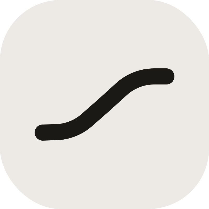
The mark is a single line that never breaks, like the context of a piece of work, which shouldn't be cut into pieces across tools.
We're glad you want to write about Flowra or work with us. This page has everything you need: the mark and logos, colors, type, and a few short rules that keep the brand the way it is.
Download brand kit
The mark, logo, app icon, colors and guidelines; SVG and PNG.
ZIP · 202 KB
Download brand kitFlowra comes from “flow”. The state where work keeps moving because there is nothing left to go looking for: no file lost in a chat, no decision that stayed in a meeting and never reached the work.
Our tagline says the same thing, and the mark draws it.
Not a seventh tool. The flow between them.
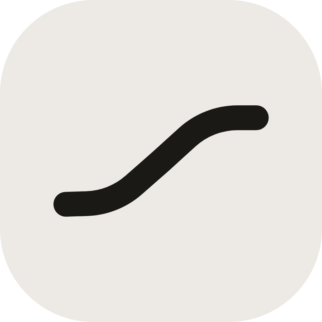
The mark is a single line that never breaks, like the context of a piece of work, which shouldn't be cut into pieces across tools.
The line starts low and ends high: two calm stretches at either end and a smooth climb between them. The same path every action takes from the inbox to “done”.
The mark doesn't sit still: in the app itself it ripples when the pointer moves over it. Hover over it to see.
What makes Flowra Flowra is more than a mark.
Tagline
Everything, in flow.
Flowra's short line: under the name in the app header, and wherever the name alone isn't enough.
Core promise
Every task, with its full context.
Flowra is an action management system with full context; not an accounting app, not a chat. Money, meetings and files are context, not the headline.
Our own vocabulary
We call some things by our own names. Use these words when you write about us.
Voice
Warm, clear and without exaggeration. We speak to you directly, keep sentences short, and never promise what hasn't been built.
Writing the name
Write the name like this: Flowra. One word, capital F, the rest lowercase. Not in all caps, not split apart.
Always simple
One accent color, a warm calm ground, and enough white space. If something can go and the message stays the same, take it out.
The core palette behind the brand's colors; tap any color to copy its code.
Primary
Neutral and status
Dark mode
One family for everything: headlines, text and numbers.
Estedad
Google FontsAa
Every task, with its full context.
ABCDEFGHIJKLMNOPQRSTUVWXYZ abcdefghijklmnopqrstuvwxyz0123456789
The brand typeface: headlines, body text and the logo's wordmark, which is Estedad Bold.
SIL Open Font License; free for any use.
Type rules
Type scale
40 / 80020 / 80014 / 40011.5 / 500Flowra's mark and wordmark, for light and dark backgrounds. The lettering is outlined, so no font is needed.




A logo needs room to stay legible.
Clear space
 xxxx
xxxxx = a quarter of the mark's side
Keep at least a quarter of the mark's side empty all around the logo. No text, image or page edge should enter this space.
Minimum size
96px
Logo with name width
20px
Mark side
16px
Monochrome symbol width
These sizes are for screens. Any smaller and the mark can no longer be read.
So Flowra looks like itself everywhere, don't do these things with the logo.
Don't change its proportions; don't stretch or squash it.
Don't add shadows, gradients or effects.
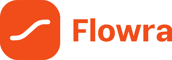
Don't recolor it, not even with the brand's own colors.
Don't rotate it in any direction.
Don't reduce its opacity.
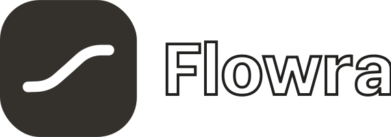
Don't outline the wordmark.
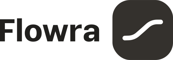
Don't swap the mark and the name; the mark always sits to the left of the name.
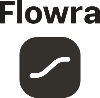
Don't place the name above the mark.
Don't place it on a similar color; for dark backgrounds, use the dark version.
Something missing?
For special use of the brand, media partnerships, or a file that isn't in the kit, write to our partnerships team.