Design system/Brand
Logo misuse
So that Flowra is always itself, don't do these nine things with the logo. Each example is the real file used the wrong way.
In codepublic/brand-kit/misuse/
Don't

Don't change its proportions; don't stretch or squash it.
Don't add shadows, gradients or effects.

Don't recolor it, not even with the brand's own colors.
Don't rotate it in any direction.
Don't reduce its opacity.

Don't outline the wordmark.

Don't swap the mark and the name; the mark always sits to the left of the name.
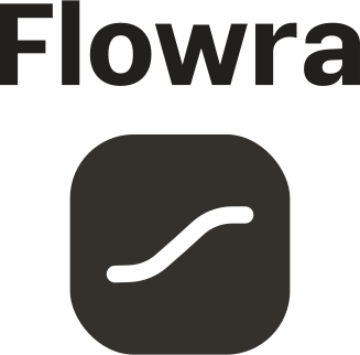
Don't place the name above the mark.
Don't place it on a similar color; for dark backgrounds, use the dark version.
Why
A logo only works when it looks the same everywhere. Any change, even a beautiful one, creates a second version, and a second version means a weaker brand. If the file you need isn't in the kit, write to the partnerships team; we'll make one.
If in doubt
- Take the file from the Brand kit and change only its size.
- Busy background? Put the logo on a plain tile instead of changing its color or shadow.
- The file you need isn't there? Ask; one will be made and added to the kit.
Related pages